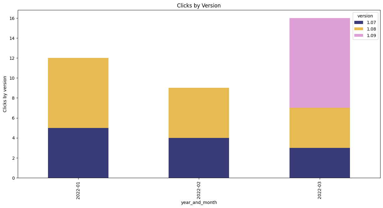
Plotting a stacked bar chart via Python Pandas and matplotlib
Pandas is a powerful data manipulation library for Python. Combined with a plotting library such as matplotlib, we can produce complex charts to clearly present summaries of data.
In this post, we will look at processing some time-based data of user clicks for particular versions of a software product.
The JSON data looks like this:
| { | |
| "data": [ | |
| { | |
| "year_and_month": "2022-01", | |
| "Clicks": 5, | |
| "version": "1.07" | |
| }, | |
| { | |
| "year_and_month": "2022-01", | |
| "Clicks": 7, | |
| "version": "1.08" | |
| }, | |
| { | |
| "year_and_month": "2022-02", | |
| "Clicks": 4, | |
| "version": "1.07" | |
| } ] } |
First, we install the dependencies from a terminal:
python3 -m pip install matplotlib pandas
Next, inside a new Python file, we import the necessary libraries:
| import matplotlib.pyplot as pl
import pandas as pd |
Next, we use Pandas to read in the JSON data:
| jsonFs1 = "../../data/clicks-count-per-month.json" data1 = pd.read_json(jsonFs1) | |
Then we normalize the data structure:
normalized_data = pd.json_normalize(data1['data'])
Aggregation
We aggregate clicks using the sum function.
Finally, we call unstack() so that we get a separate series of total clicks per month, for each version:
# === Clicks per month ===
## aggregate and then unstack, so 1 series for each version
df_unstacked = normalized_data.groupby(['year_and_month', 'version'])['clicks_int'].sum().unstack()
The data is now ready to plot.
Plotting the data
Using matplotlib, we arrange a single subplot with figure 'fig' and axis 'ax':
| fig, ax = plt.subplots(figsize=(15,7)) | |
| ax.set_title("Clicks by Version") | |
| ax.set_xlabel('Year and Month') | |
| ax.set_ylabel('Clicks by version') |
Now, we use an extension on the Pandas dataframe, to draw the chart:
df_unstacked.plot(ax=ax, colormap='tab20b', kind='bar', stacked=True)
Finally, we save the chart to a file:
fig.savefig(pngFs1,bbox_inches="tight")
The resulting chart is like this:
Complete Example
For a full code example, see this Python script in my Athena-cli github project.
Further Reading
Pandas is a powerful data manipulation and analysis library for Python.
matplotlib plotting library for creating static, animated, and interactive visualizations in Python.

Comments
Post a Comment