Problem: In Data Visualisation, there can be a challenge with displaying data where two or more series have overlapping data points. This is known as overplotting.
An example is a trend plot, where the lines from two series overlap, so then one series becomes hidden:
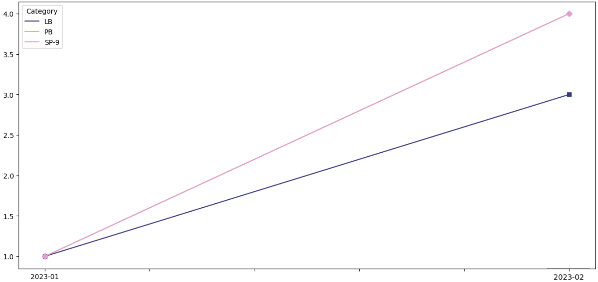
Here, the series PB cannot be seen - perhaps it has no data points, or perhaps it is behind LB or SP-9 - we really cannot see...
Solution: add 'jitter' to the data
In order to display data that has overplotting, one solution is to add a small amount of 'jitter' to the data, so that the plots are slightly offset from each other. The jitter amount needs to be very small, much smaller than the unit of measure, but large enough to just offset the series, so that the display is no longer overplotting.
Example: add jitter of 0.025 to data that has unit differences of 1.0:

Now, the series are slightly offset from one another, so that the PB series becomes visible. It can be seen that in fact it matches the SP-9 series.
The offset created by the jitter is small enough so that the plot is still accurate.
Example Python code to add jitter of 0.025 to a Pandas dataframe:
Further Reading
In this post, we looked at a very simple example involving a trend plot.
However the problem of overplotting is more common with scatter and bubble plots.
For more about overplotting and scatter plots, see this article: How to avoid overplotting with Python.
Comments
Post a Comment